Nota!
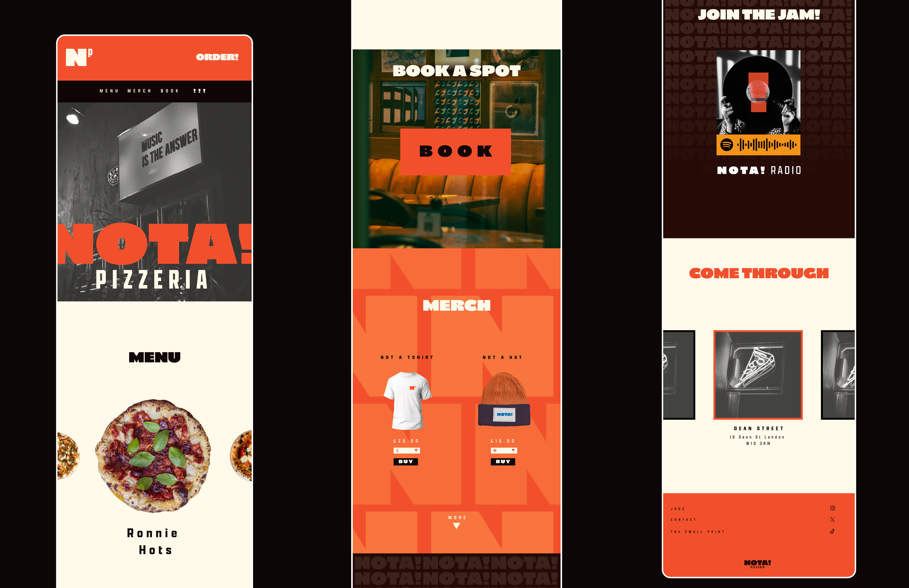
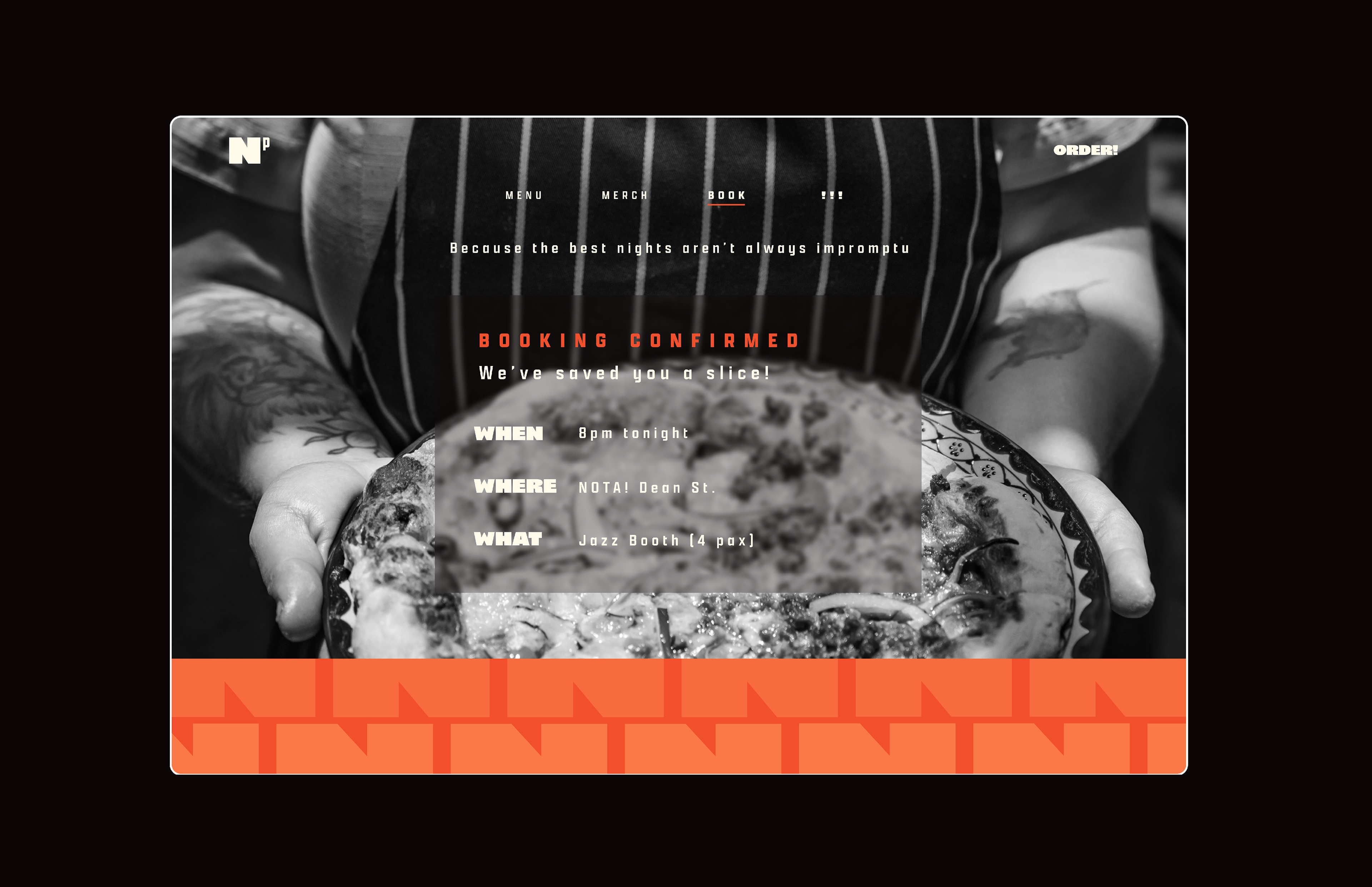
Overview: Naming and visual identity re-brand for a UK based restaurant chain with the aim of reconnecting to the brand’s jazz roots and appealing to a target audience sceptical of chain restaurants. Nota (‘note’ in Italian) takes the energy and vibrancy of jazz music and infuses it into the brand’s core visual identity.
The wordmark draws inspiration from typefaces used on vintage jazz posters. Combined with a daring colour palette, NOTA! blends historical references with more contemporary, vibrant jazz sub cultures.
Repeated elements are used throughout the brand's visual communication conveying energy but also evoking repetitive musical riffs and phrases common in Jazz music.
Client: UK based pizza restaurant chain
Concept: Combining the Unexpected
Disciplines: Brand, Digital


